Designing your plugin UI
Lay out knobs, faders, and displays, bind them to your patch, and preview the real plugin interface live.
For builders ready to give their patch a face.
The DESIGN tab is where your patch becomes a plugin people can actually play. What you see on the canvas is the real interface — the same one that ships inside the exported plugin — running live against your DSP graph.
The Design Canvas at a glance
- Center: the canvas — a live preview of your plugin window at its actual size.
- Left sidebar: the Layers panel (the structure of your UI) and the Components panel (the library of controls you can add).
- Right sidebar: the inspector — properties for whatever is selected.
- Toolbar: switch between Edit mode (select, move, resize) and Preview mode (interact with the UI like a player would), plus shape tools and a settings menu with undo/redo, grid, and snapping.
The plugin window size is set in Project Settings — that's the size hosts will open your plugin at.
Placing controls
- Open the Components panel in the left sidebar.
- Click a component to insert it onto the canvas.
- Drag it into position and use the corner handles to resize. The grid and snapping (in the toolbar's settings menu) help keep things tidy.
- Select any element to edit its properties — colors, labels, ranges, and more — in the inspector.
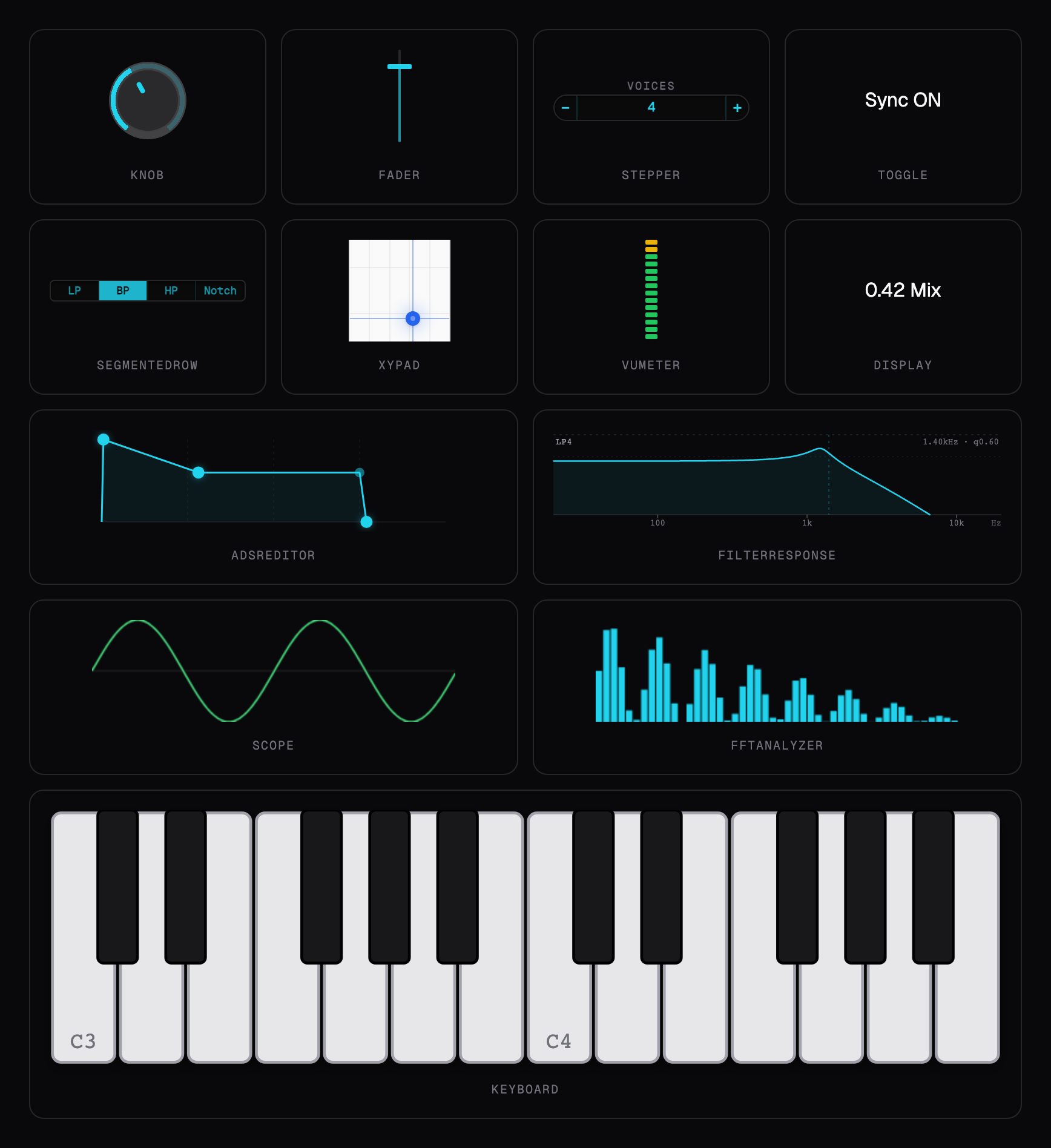
The component library includes:
| Component | Use it for |
|---|---|
| Knob, Fader, Stepper, Toggle | The classic plugin controls |
| SegmentedRow, ScrubStrip | Mode pickers and value strips |
| XYPad | Two parameters on one pad |
| ADSREditor | A draggable envelope display |
| Keyboard | An on-screen keyboard |
| Scope, FFTAnalyzer, VUMeter, FilterResponse | Live visual feedback from the audio engine |
| Display, Image, Transport | Read-outs, artwork, and play controls |
You can also draw rectangles and other shapes with the toolbar's shape tools for panels, backgrounds, and dividers.
Binding controls to your patch
A knob on the canvas does nothing until it's bound to a parameter in your DSP graph. The flow has two halves:
- Expose the parameter. In the DSP tab, open the Node inspector, find the parameter, and click the small circle next to it. Exposed parameters are your plugin's public controls.
- Bind the control. Back in the DESIGN tab, select a knob or fader and pick the parameter from the binding dropdown in the inspector.
When you bind a control to a new parameter, its range, default, and step are filled in automatically from the DSP side — adjust them afterwards if you want a narrower sweep.
Tip Bind first, style later. Once a control is bound you can twist it in Preview mode and hear your patch respond, which makes layout decisions much easier.
Live preview
- Click Preview mode in the toolbar to interact with your UI exactly as a player would — knobs turn, meters move, scopes draw the actual audio.
- Open the MIDI window from the bottom bar and play notes while previewing to test the full experience.
- Switch back to Edit mode to keep arranging.
Because the canvas hosts the real plugin UI, there's no separate build step — every change is immediately the truth.
AI help for UI
The AI assistant can work on the Design Canvas just like it works on the DSP graph:
- "Lay out a UI for this patch" — it places and binds controls for your exposed parameters.
- "Make it dark with orange accents" or "arrange the filter section in a row" — it edits styles and layout.
- It can take a screenshot of the current canvas to check its own work, resize the plugin window, and even generate background artwork.
As always, everything it does lands in the same layers and inspector you use, so you can refine the result by hand.